Wireframing allows you to identify potential problems with the user flow, screen layout, and functionality early on before any code is written.
We’ll cover how to transition from pen-and-paper sketches to digital designs using tools. The multi-step process includes rapid prototyping and iterations based on user feedback.
Starting with low-fidelity wireframes, we’ll progress to the first interactive prototypes and finally to high-fidelity designs.
You’ll discover how qualitative and quantitative research can inform your design choices, ensuring your app meets user expectations.
This guide will help you create effective app wireframes that form the foundation of successful product design.
What Are Mobile App Wireframes?
An application wireframe is an essential part of mobile wireframe design. It’s a digital visualization that shows the function and user flows of an application.
Using sketches, designers map out click journeys, CTA placements, and page intent. Mobile phone wireframes start with low-fidelity designs, using basic shapes and minimalist outlines to define the layout.
These then progress into more complex elements, with images, text blocks, and interactive buttons. Eventually, they become high-fidelity prototypes, combining visual and stylistic elements to match branding, leading to the final product.
What To Do Before Creating Mobile App Wireframes [Processes Involved in Pre-Wireframing]
You hop into the wireframing stage once you have a clear understanding of the timeline of your app idea. To align with user needs and business goals, you need to follow the pre-wireframing stages that set the foundation for a successful mobile app.
Here’s how you can start:
Step # 1: Outline the Target User Flow
Before wireframing, it is necessary to know the number of screens that your app will require and how the users will interact with them.
This is where outlining the target user flow helps. The user flow is a series of steps users take to achieve a specific goal within the app. Knowing this flow aids in how to make wireframes effectively.
User flows can have different paths and don’t have to be linear. Start by sketching out the user flow on paper or using a digital tool. Use basic objects like boxes and arrows to represent screens and interactions. For example, in a shopping app, you might have a flow like this:

This flow illustrates how users move from one screen to another to complete a purchase. Outlining these steps helps create a wireframe for an app that effectively connects these screens and interactions, providing a seamless user experience.
Step # 2: Sketch the Core Elements of the User Flow
The next step in wireframe design for a mobile app involves sketching the core elements of the user flow. Visualizing these elements is crucial for creating a cohesive and intuitive user experience.
Sketch on paper or use a digital prototyping tool, keeping the process simple and allowing creativity to explore various design directions.
Start by sketching quick concepts and sharing them for feedback. Iterate on these sketches, always considering the user’s perspective.
What goal are they trying to accomplish? For a shopping app, the goal might be to find and purchase a product easily.
For each screen, ask:
- What is the page’s purpose?
- How does this page help the user or business achieve the goal?
For instance,
- Home Screen: Purpose is to welcome users and showcase featured products. Helps users by providing quick access to popular items, aiding the business by promoting high-demand products.
- Product Listing: Purpose is to display available products. Helps users by offering a range of options, aiding the business by increasing product visibility.
- Product Detail: Purpose is to provide detailed information about a product. Helps users make informed decisions, aiding the business by encouraging purchases.
- Cart: Purpose is to review selected items. Helps users by summarizing their choices, aiding the business by streamlining the purchase process.
- Checkout: Purpose is to complete the purchase. Helps users finalize their orders, aiding the business by converting sales.
- Confirmation: Purpose is to confirm the purchase. Helps users feel assured, aiding the business by reinforcing successful transactions.
The Wireframing Process Of A Mobile App

The process of wireframing is one of the important phases within the mobile app development lifecycle. It begins when the sketches for the designs are done. These sketches develop into low-fidelity wireframes that outline the app’s structure.
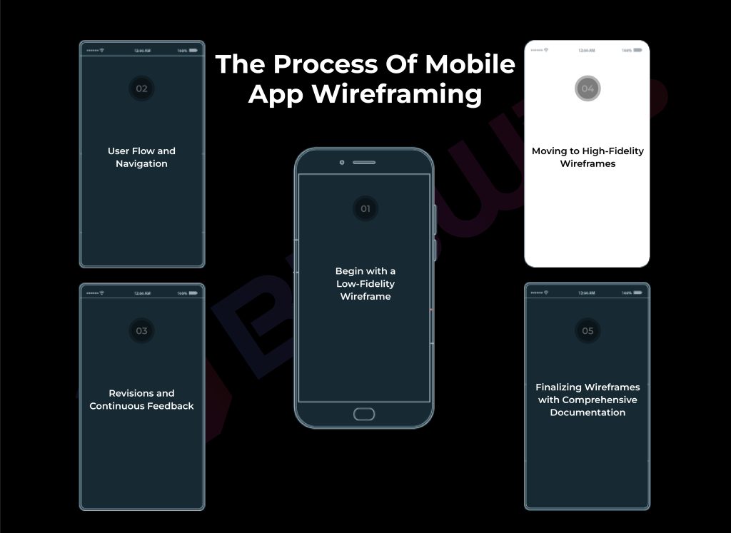
Step # 1: Begin with a Low-Fidelity Wireframe
Start by selecting the right screen sizes and an entry-level wireframe app. Focus on translating basic details into simple digital outlines. Use basic shapes like boxes for frames, a tab bar, logos, and other elements. A medium screen size works better, making it adaptable to multiple screens and different devices.
Low-fidelity wireframing allows one to structure and lay out an app without getting bogged down in design details like color or typography. An intuitive and user-friendly interface is created using simple shapes and lines.
This approach ensures users can navigate and interact with your app’s features effectively. Concentrate on the app’s overall functionality and user flow, setting a solid foundation for more detailed designs later. With low-fidelity wireframes, the focus remains on creating a seamless and efficient user experience.
Step # 2: User Flow and Navigation
After laying down the basic structure with low-fidelity wireframes, the next step is mapping out user flow and navigation. This involves understanding the journey a user takes within the app, from initial launch to the final action.
Ensure a smooth, logical progression through the app’s features to avoid confusion and boost user satisfaction.
Clear pathways that developers and designers can visualize are essential. This approach helps make each screen intuitive and easy to use.
Effective wireframe design for mobile apps includes mapping out these flows early to ensure a seamless experience.
Focus on how users will navigate and interact with your app’s features, ensuring every step feels natural. Prioritizing user flow and navigation sets the stage for a well-organized and user-friendly mobile app.
Step # 3: Revisions and Continuous Feedback
Focus on iterative feedback and revisions to refine your mobile application wireframe. Gather input from team members, stakeholders, and test users to identify usability issues and unclear navigation paths.
This process helps improve the wireframe based on user needs, ensuring a user-centered design.
Create a cycle of reviewing and revising the wireframe, continuously incorporating feedback to develop the best version. This iterative approach allows for adjustments before moving on to high-fidelity designs.
Addressing potential issues early ensures that the final product meets user expectations and provides a smooth, intuitive experience.
Through revisions and continuous feedback, the app design can be accurately shaped to deliver the best user experience.
Step # 4: Moving to High-Fidelity Wireframes
After refining your initial sketches, the next phase is to wireframe an app with high-fidelity wireframes. This step involves adding detail beyond the basic structure of the low-fidelity versions.
Add specific design elements, such as colors, typography, and images, to create a realistic visualization of the final product.
High-fidelity wireframes provide all the details that concern the view and functionality of the user interface to guarantee a smooth user experience.
This will help iron out other problems and changes before coding.
High-fidelity wireframing means you will get a polished, user-friendly application that meets aesthetic and functional requirements.
This phase transforms your wireframe into a comprehensive blueprint ready for development. To streamline this transition, developers use the most popular mobile app development frameworks .
Step # 5: Finalizing Wireframes with Comprehensive Documentation
In the final step, ensure every element of your wireframe is polished and represents the app’s final vision.
Clearly define and lay out user interface elements, navigation paths, and functionalities. Detailed documentation at every stage of the design process helps guide developers and stakeholders.
Document the rationale behind each decision to prevent misunderstandings and ensure everyone is on the same page.
This detailed documentation helps developers accurately translate the wireframe into a functional app.
Thoroughly finalizing and documenting your wireframe sets a strong foundation for the development phase, ensuring a smooth transition from design to coding. This step is essential to wireframe an app effectively and create a seamless user experience.
Hire Top UI/UX Designers for Your App!
Over 150+ clients trust BitsWits for their wireframing needs!
Hire Expert
Why Are Mobile App Wireframes Important?
Mobile app wireframes provide a clear picture of how end-users will interact with the app. They help ensure the app effectively solves problems for customers and lays the groundwork for a successful project.
Wireframing is to identify the outline of the content and create a solid foundation for future steps of the design process. Effective wireframes simplify both visual and interaction design.
Visual Blueprint of the App
Wireframes act as a visual blueprint, clearly conveying the app’s vision to project teams, investors, and stakeholders.
This clarity helps secure funding and ensures everyone is on the same page. Wireframes demonstrate different screen functions and app features, making it easier to understand the app’s structure and hierarchy.
Why is a wireframe of your app important? Because it brings your vision to life.
Saves Time and Money
Wireframing saves a lot on development costs and time by detecting flaws and pain points in the early stages of design.
Fixing issues on paper is much easier and less costly than addressing them post-development.
A clear wireframe largely enhances understanding among both developers and designers of the project. This reduces development costs and streamlines the timeline for the whole project.
Faster Iterations
Wireframes enable faster iterations and user testing, making the large and intimidating development process more manageable.
Breaking the process into smaller tasks gets the ball rolling quickly. During the early stages, wireframes allow for easy adjustments based on feedback, speeding up the refinement of app features and functions.
Prevents Mistakes
Wireframes help avoid mistakes by providing a clear outline of the app’s content and functionality.
It is improbable that there will be miscommunication between developers and designers. However, with everything laid out in wireframing, there will be no such case at all and everyone would understand the project requirements efficiently.
Addressing potential issues early in the wireframing process is far less challenging than fixing them later in development.
Facilitates Collaboration
Wireframes facilitate collaboration between different teams, such as content creation and UX/UI design.
A well-designed wireframe provides a solid foundation for future design steps, making the visual and interaction design much easier.
Clear communication through wireframes helps all team members contribute effectively, ensuring a cohesive and well-thought-out app design.
Wireframes vs. Mockups vs. Prototypes: What’s the Difference?

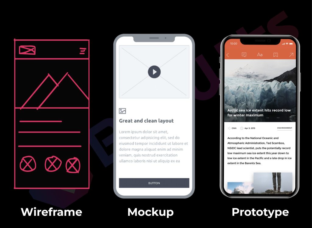
Wireframes are simple, low-fidelity sketches of a website or an app; mockups are medium-fidelity visual representations of a UI design; and prototypes are detailed and high-fidelity designs that contain the whole user journey in a digital product.
If you’re still hung up on the query what is the difference between wireframe, prototype, and mockup then don’t worry, this was just an overview. Let us explain a little more to help you understand the differences and their importance in the design process.
Wireframes
Wireframes are low-fidelity blueprints of UI designs that outline the layout and structure of one or multiple screens. As the first step in the design process, wireframes focus on basic elements without colors, images, or large text chunks. They can be sketched by hand or created using digital tools.
Mockups
Mockups are medium-fidelity, advanced versions of wireframes that incorporate UI elements such as colors, logos, fonts, and other visuals. They offer a closer representation of the final product, helping investors and stakeholders visualize branding, color, and typography.
Prototypes
Prototypes are interactive blueprints that include clickable functions, allowing navigation between screens. They enable end-users to experience the user flow and journeys of the finished digital product. Prototypes offer increased detail and functionality, helping to simulate the final app’s behavior and usability.
Also Read: Best Practices for Mobile App Wireframe in 2025
What are the 5 Best Wireframe Tools?
While many designers use pencil and paper sketches, they often transition to digital wireframing apps for simplicity and speed. With dozens of options available, we bring you the top five wireframe tools after thorough research and testing:

Sketch is a powerful, lightweight vector design tool ideal for Mac users. It’s great for creating wireframes, modern UI, icons, and interaction designs. Simpler and more intuitive than Affinity Designer or Adobe Illustrator, Sketch includes layout templates and syncs with Unsplash for easy access to royalty-free photos.
Figma is a cloud-based tool perfect for both standalone designers and large teams. It’s an easy tool for the entire design process, from mapping user flows with FigJam to creating your own UI components. With Figma, you can easily create artboards, add shapes and text, and use a vector-based pen for precise design work.
Moqups offers simplicity and ease of use for a variety of design needs. Create flowcharts, wireframes, sitemaps, graphs, and mockups with ease. Whether designing a mobile app, landing page, or e-commerce dashboard, Moqups provides versatile diagram and whiteboard templates. It’s great for business strategy, flowcharts, mind maps, basic charts, and funnels.
Mockflow is a wireframe tool that supports real-time online collaboration, making it perfect for team projects. Its clean and intuitive interface simplifies wireframing with diverse and organized UI packages and design elements. Mockflow’s organizational functionality includes separate design spaces for each project, ensuring a streamlined workflow and efficient project management.
UXPin offers a rich feature set that might be challenging for new designers to pick up, but it definitely pays off. With a built-in library of UI elements, you can drag and drop directly onto the canvas to create higher-fidelity wireframes. This tool excels at fine-tuning the flow and functionality of your designs, making it ideal for detailed projects.
Final Thoughts on Mobile App Wireframing
Creating a mobile app wireframe requires a lot of research, analysis, collaboration, and testing.
Start with pre-wireframing steps like outlining the target user flow and sketching core elements. Then, move into the wireframing stages: begin with a low-fidelity wireframe to establish the app’s structure, detail user flow and navigation, and incorporate revisions and continuous feedback.
Next, transition to high-fidelity wireframes, adding specific design elements, and finalize with comprehensive documentation.
Each step in wireframe design contributes to crafting a user-friendly app. The effort invested in this process ultimately leads to a polished, successful app that meets user needs and stands out in the market.
Our professional team at BitsWits creates wireframes that ensure a seamless user experience across all devices. We focus on designing user flows, mapping navigations, and saving you time and money by avoiding costly mistakes. Partner with us for precise, efficient development.
FAQs
